Improved Contact List and Form

Time for another changelog! This time I want to introduce a brand new feature that shows the time and date of the last activity on a contact. I've also made the contact form better by making the magnetic website input properly enter the website for you, based on the email address. Let's get to it!
⚡️ Improved contact list
I’ve made a lot of improvements to the contact list which I think you'll enjoy. Mainly:
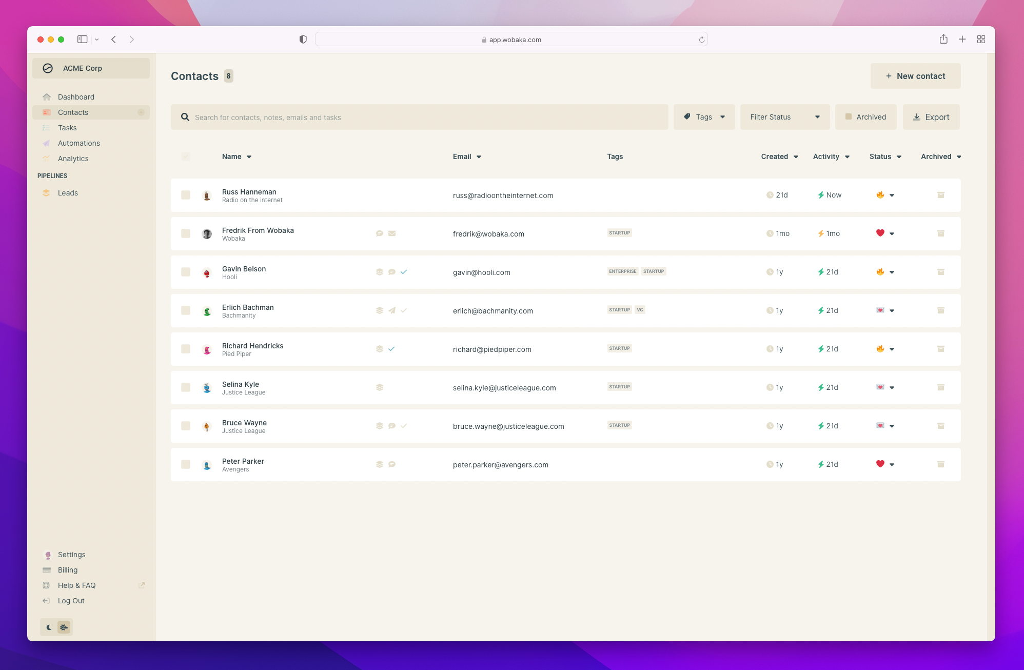
- Dates are more compressed to take less space
- You can now see the last activity on each contact
- Tags are shown on each contact
Seeing the last activity on each contacts allows you to easily view contacts that needs attention. Simply order the list by last activity and work your way from there.
Yellow and red icons indicate there has been no activity on the contact for at least 30 and 90 days respectively. The green icons show you that there has been activity on the contact in the past 30 days.
I've also removed the detailed view for contacts as tags are now always included. This is what the brand new contact list looks like. 👀

🧲 Magnetic contact form
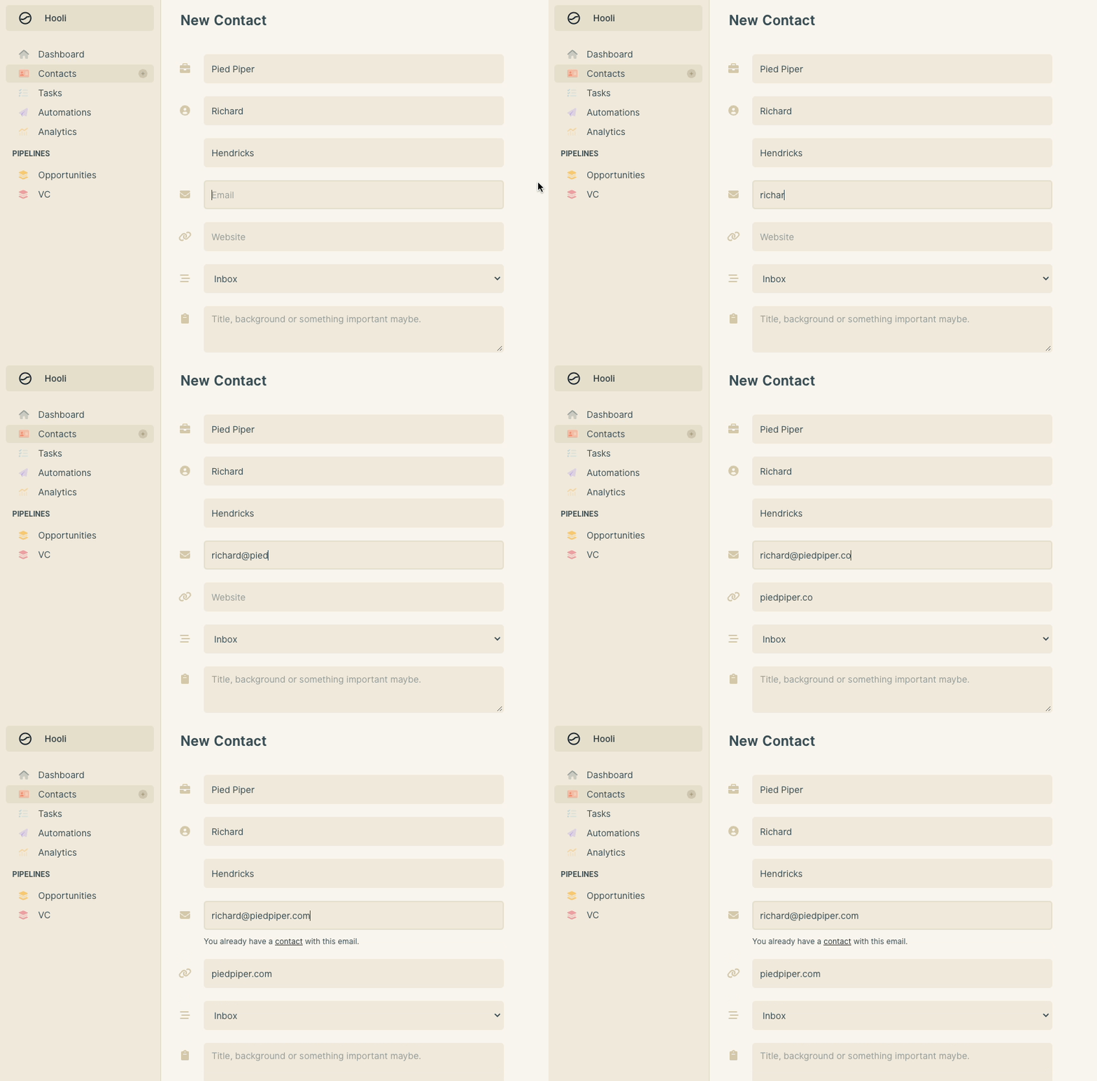
The contact form now properly enters the contact's website for you when you add an email address. I've also made sure that it doesn't copy over the domain if it's a Gmail, Fastmail or other shared domain name. One less input to fill out! 🙌

That's all folks!
That's it for this changelog! I hope you'll enjoy the new features. Let me know what you think I should work on next on [email protected] 🤗