Making a Better CRM Dashboard


The first dashboard I made for Wobaka.com was basically just a "Have a nice day" title and nothing else. But as time past I thought it would be nice to show you some quick data so you get a feeling of how you're doing by just having a glance at it. Today, I deployed a brand new version and I just want to share how the dashboard has evolved the past 3 months. Unfortunately, I don't have a screenshot of the first text-only version, so I'll leave that to your imagination 😜.
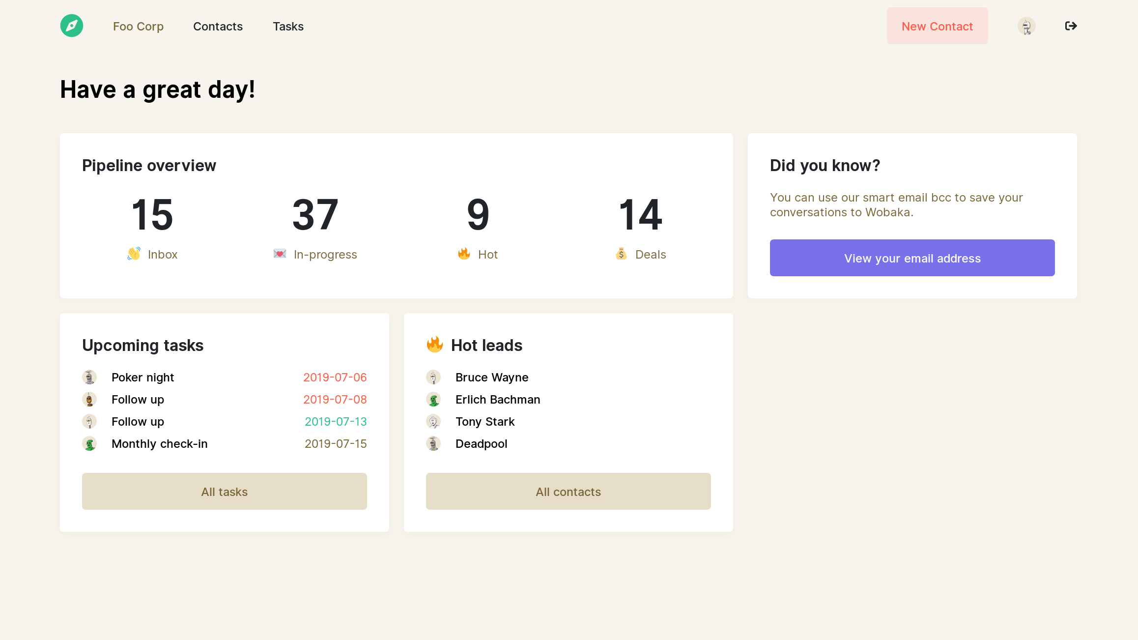
First version
For the first version I really wanted to show you the pipeline overview. By then Wobaka didn't have a way to track deals so it's basically a break-down of contact statuses. I also wanted to highlihgts contacts that were on their way to being customers as well as your upcoming tasks.
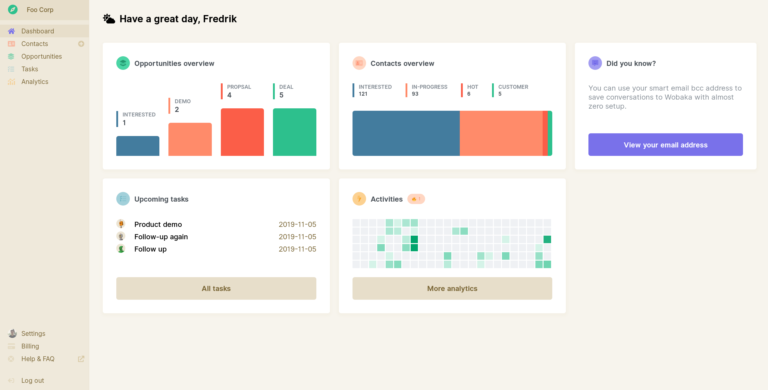
Today
The changes I decided to do was:
- Wobaka now has support for deals, so it made sense to show a pipeline overview of that
- I still wanted to show the break-down of contact statuses but decided to do so with a stacked bar instead.
- I really like GitHub's activity heatmap, so I decided to make one for Wobaka. I find it really useful to keep track of my productivity and current streak.
That's it
What do you think? Did I make it better? Let me know on Twitter @drikerf.
